
How To Make Bar Graph In Excel
Discover step-by-step instructions on creating bar graphs in Excel. Enhance your data visualization skills and present your information effectively.
This document provides a step-by-step process to create bar graphs in Microsoft Excel. Follow the instructions to visualize your data effectively using bar charts.
Step 1
Select the data you want to use for the graph.

Step 2
Click on the Insert option.

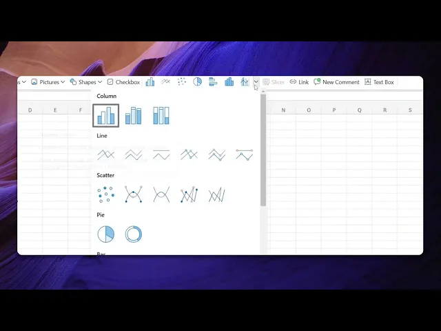
Step 3
Within the Insert menu, you will find a variety of graph options.

Step 4
Select the bar graph option.

Step 5
The selected data will be displayed as a bar graph, as shown below.

This is a step-by-step guide on how to make Bar graph in Excel.
Pro tips for how to make bar graph in Excel
Choose the right data range – Select only the relevant data to avoid extra blank spaces or incorrect axis labels.
Customize the chart for better clarity – Use chart elements like axis titles, legends, and data labels to improve readability.
Use different bar colors for comparison – Enhance data visualization by using contrasting colors for different data sets.
Common pitfalls and how to avoid them
Selecting incorrect data range always highlight the precise data set to avoid empty or extra bars.
Forgetting to label axes always add clear axis labels for better understanding of the chart.
Overloading the chart with too many colors keep it visually simple by using a limited color palette.
Common FAQs for how to make bar graph in Excel
What is the difference between a bar graph and a column graph in Excel?
A bar graph displays data horizontally, while a column graph represents data vertically. Both are useful for comparing values across categories.Can i customize the colors and labels in an Excel bar graph?
Yes, you can customize colors, labels, titles, and gridlines by selecting the chart and using the Chart Tools options.Why is my Excel bar graph not displaying correctly?
Ensure your data is properly structured, with categories in one column and corresponding values in another. Also, check if you've selected the correct chart type.How do i add data labels to my bar graph in Excel?
Click on the chart, go to Chart Elements (the plus icon), and check the Data Labels option to display values on the bars.
If you're an instructor or content creator looking to make tutorial videos, give a try. It transforms rough screen recordings into polished, studio-style videos that are ready for sharing with your audience. Plus, it automatically generates a step-by-step guide based on the video you create. Fascinating, right? Start by creating your first tutorial for free with trupeer.ai .
